Skip to content
UVA

iRecycleRecycle it right

An app that identifies what you are holding, gives the recycling rules for where you live, and rewards you for keeping at it.

Role
UX researcher and designer
Team
5 people, 4 weeks
Tools
Figma, Mural, Teams
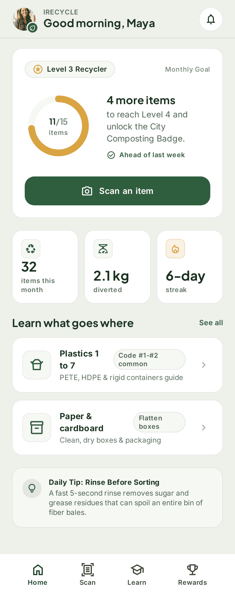
iRecycle home screen: Good morning, Maya, a Level 3 Recycler card with a ring at 11 of 15 and a note that 4 more items unlock Level 4 and the City Composting Badge, a wide green Scan an item button, this month's stats of 32 items, 2.1 kg diverted and a 6-day streak, a Learn what goes where list, a daily tip and a tab bar with Home, Scan, Learn and Rewards.

Overview

Recycling shouldn't be this hard.
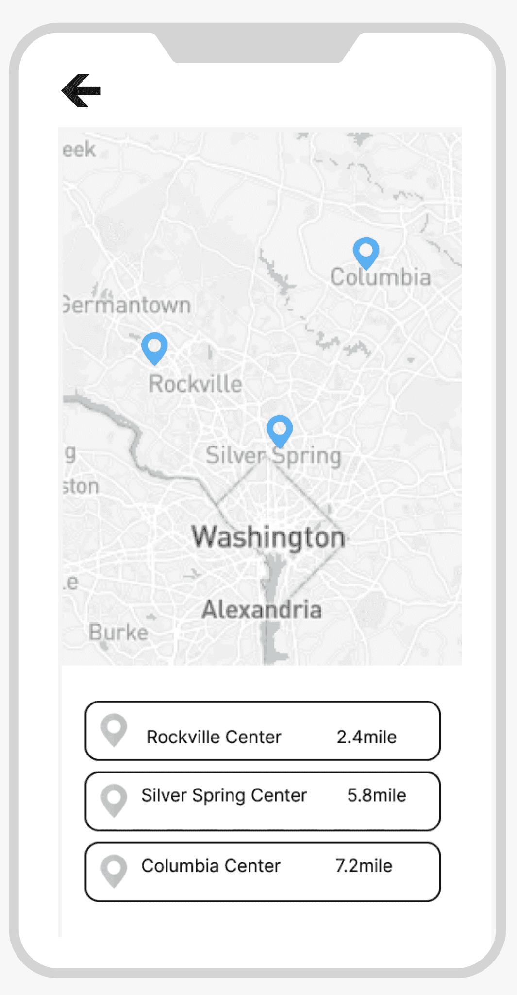
Lo-fi recycling locations wireframe: a map with three pins and a list of nearby centres, Rockville 2.4 miles, Silver Spring 5.8 miles and Columbia 7.2 miles.
The recycling locations wireframe: nearby centres, each with its distance.

Over 70% of users were unsure how to recycle correctly. Local guidelines were confusing, and once people did try, nothing gave them a reason to keep going.

How might we build a simple tool that helps people recycle correctly, with personal, practical information and a reason to make it a habit?

We set out to build three things:

  • Point the camera at an item and the app identifies the material.
  • See the recycling rules for your own area.
  • Track your habit and level up as you go.
Research

Listen first, then draw.

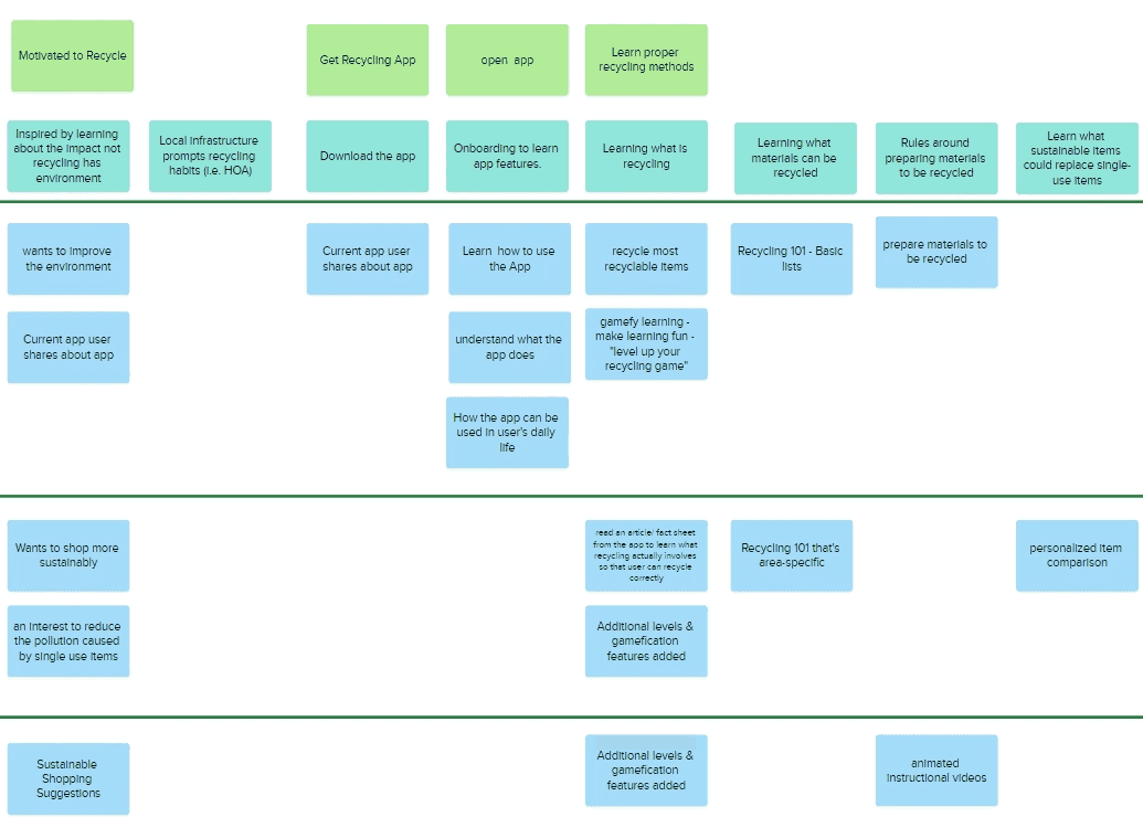
We ran surveys, then eight semi-structured interviews. From them we built personas and a map of every step someone takes, from wanting to recycle to doing it well.

8

semi-structured interviews, after a round of surveys

Who we talked to
People who already wanted to recycle, some of them using a recycling app today.
What we asked
What got them started, where the rules lost them, and what would keep them at it.
What we saw
People stalled at learning what can go in the bin, and asked for learning that feels like a game.
User map made of sticky notes. Green notes along the top give each stage, from motivated to recycle to learning proper methods; blue notes below list what people wanted at each stage.
Our user map: each column is a stage, the notes below it are what people needed there. One note in the learning column reads “gamefy learning, make learning fun, level up your recycling game”.

Ideate

Six screens on paper first.

We sketched six screens in low fidelity: profile, recycling locations, home, learning, resources and a module complete page. Then we put them in front of testers.

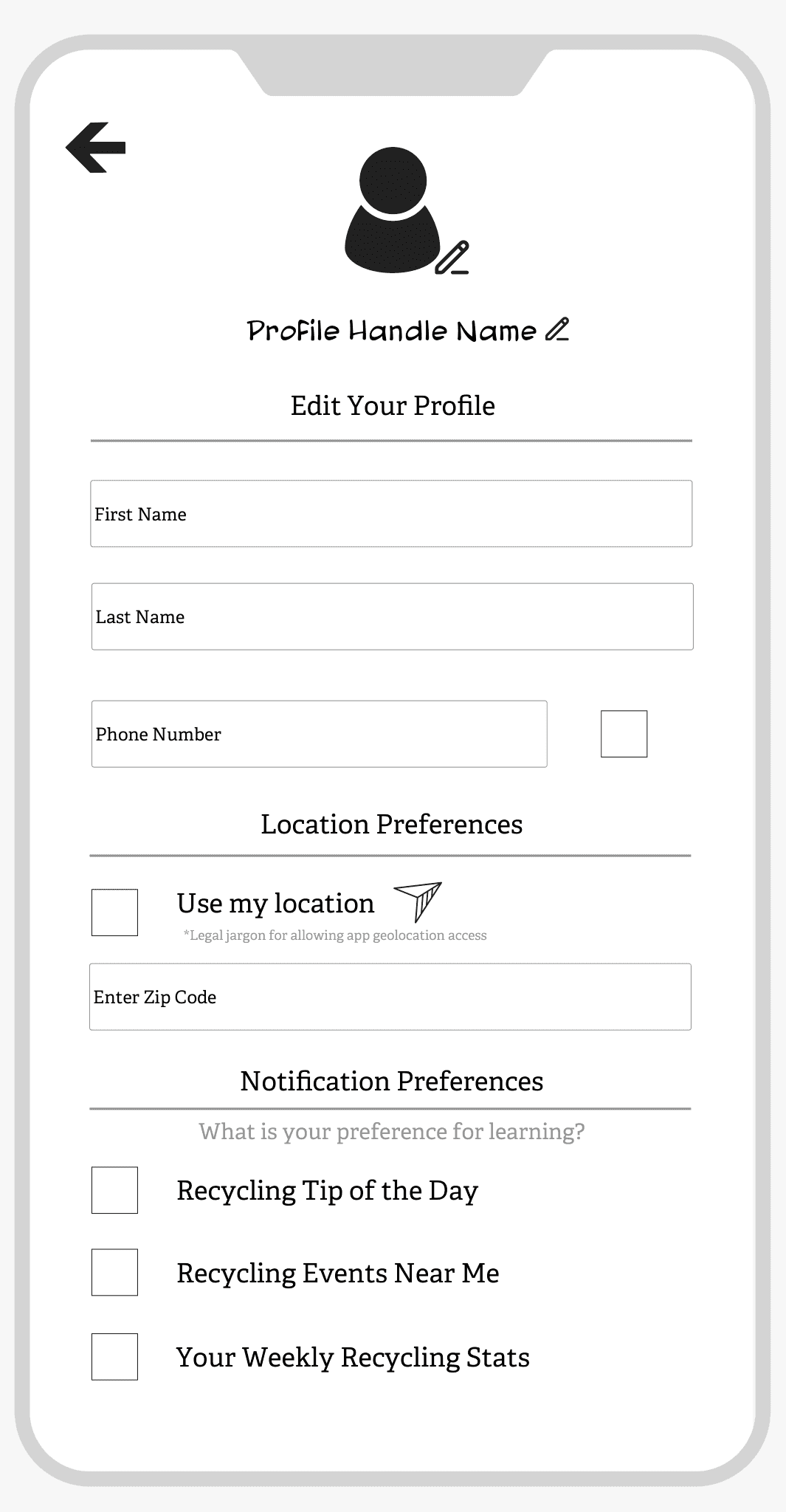
  • Lo-fi profile wireframe: name and phone fields, location preferences with use my location or a zip code, and notification choices for a recycling tip of the day, events near me and weekly stats.

    Profile

  • Lo-fi recycling locations wireframe: a map with three pins and a list of nearby centres, Rockville 2.4 miles, Silver Spring 5.8 miles and Columbia 7.2 miles.

    Recycling locations

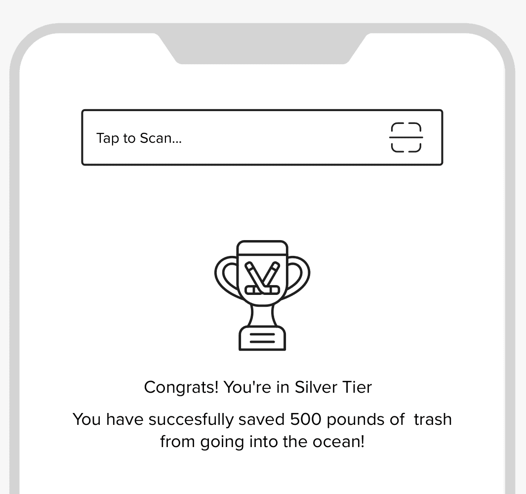
  • Top of the lo-fi home wireframe: a small Tap to Scan bar, then a trophy and a note that you reached Silver Tier and saved 500 pounds of trash from the ocean.

    Home

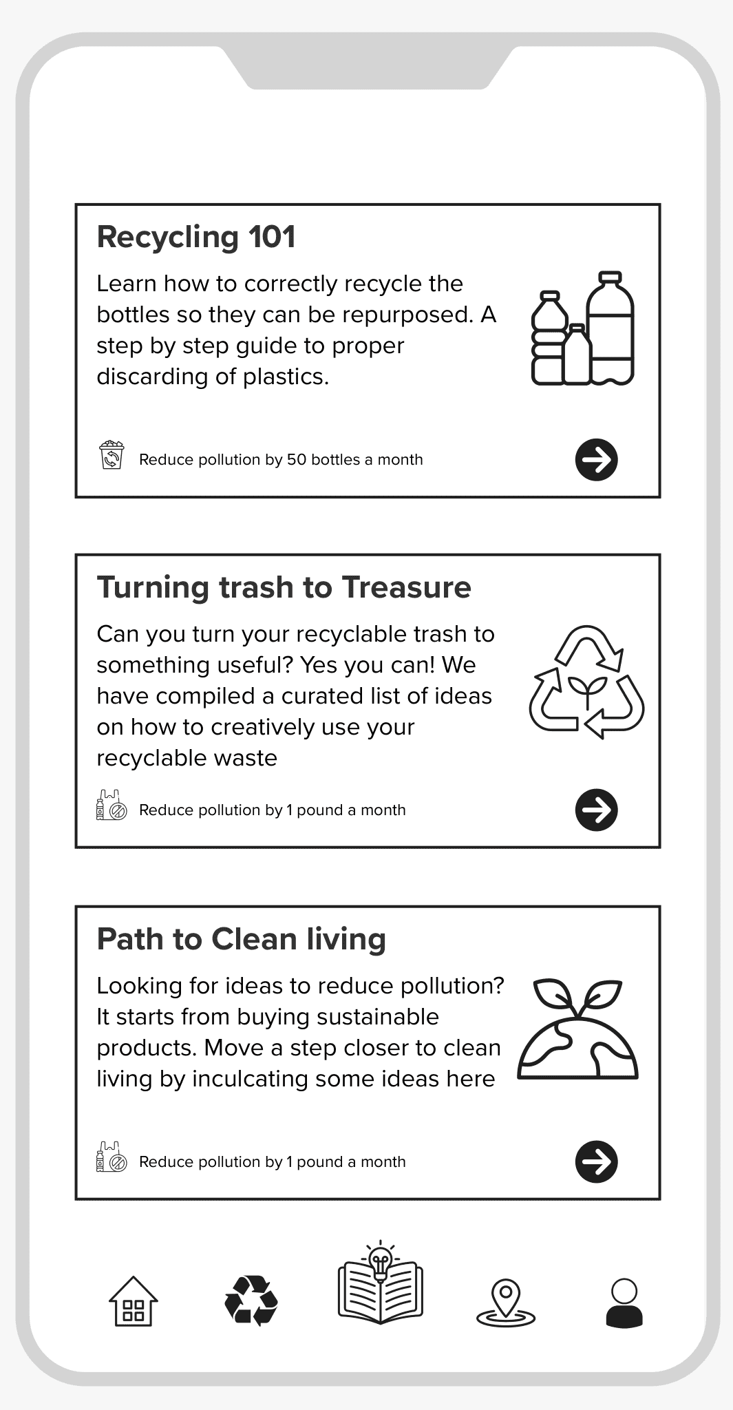
  • Lo-fi learning wireframe: three guide cards, Recycling 101, Turning trash to treasure and Path to clean living, each with a short summary.

    Learning

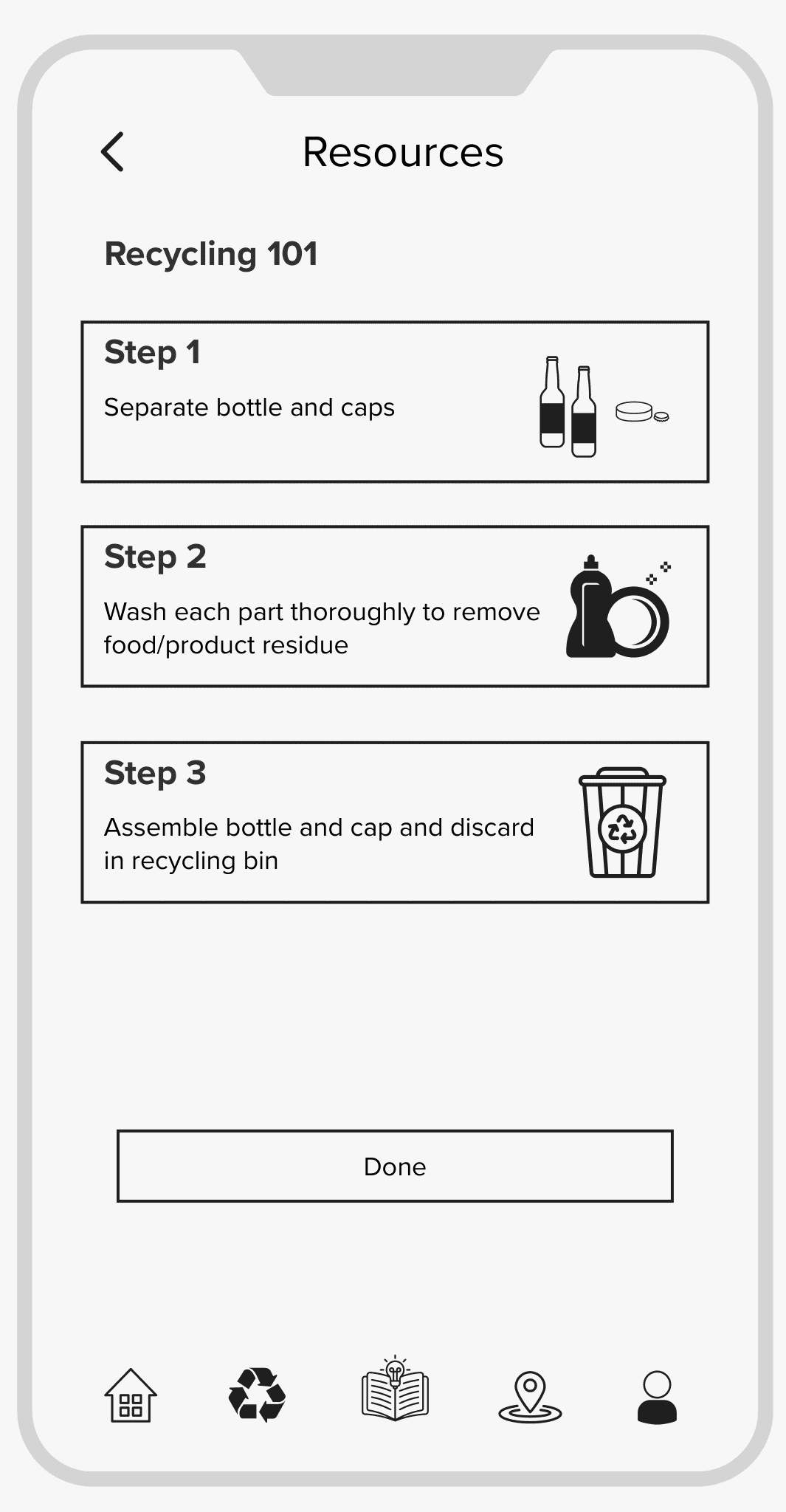
  • Lo-fi resources wireframe for Recycling 101: step 1 separate bottle and caps, step 2 wash each part, step 3 assemble and discard in the recycling bin, then a Done button.

    Resources

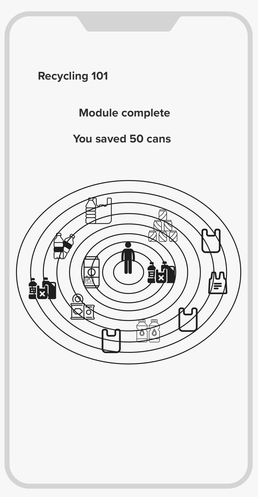
  • Lo-fi module complete wireframe: Recycling 101, module complete, you saved 50 cans, above a target of rings with recyclable items around a person.

    Module complete

What testers told us:

  • “I had trouble finding the scanner button.”

  • “Some of the icons are confusing.”

  • “I didn't understand the module complete page.”

In the final design the scanner became the largest button on the home screen and got a tab of its own.

Design: the three final features

Top of the lo-fi home wireframe: a small Tap to Scan bar, then a trophy and a note that you reached Silver Tier and saved 500 pounds of trash from the ocean.
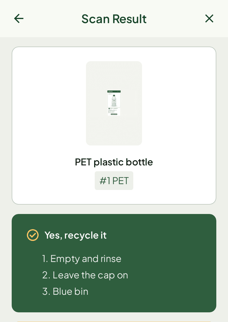
iRecycle scan result screen: a PET plastic bottle tagged #1 PET, a green Yes, recycle it block with three steps, empty and rinse, leave the cap on, blue bin, and a strip reading +1 item, 3 to Level 4 with a bar at 75%.
Before and after: the Tap to Scan bar in the home wireframe, then the scan result screen in the final design.

Material scanner

Point the camera at an item and the app tells you what it is made of.

In the home wireframe the scanner was a small Tap to Scan bar at the top, and a tester could not find it. The final design makes it the largest button on the home screen, with a tab of its own, and the result is plain: the app names the material, says yes or no, and gives three steps.

Lo-fi learning wireframe: three guide cards, Recycling 101, Turning trash to treasure and Path to clean living, each with a short summary.
Lo-fi resources wireframe for Recycling 101: step 1 separate bottle and caps, step 2 wash each part, step 3 assemble and discard in the recycling bin, then a Done button.
The learning and resources wireframes.

Localized recycling guides

Guides teach the rules step by step, each step small enough to follow at the bin.

The learning page lists three guides, from Recycling 101 to turning trash into something useful. Each one opens as numbered steps: separate the bottle and cap, wash each part, put them in the recycling bin.

Lo-fi module complete wireframe: Recycling 101, module complete, you saved 50 cans, above a target of rings with recyclable items around a person.
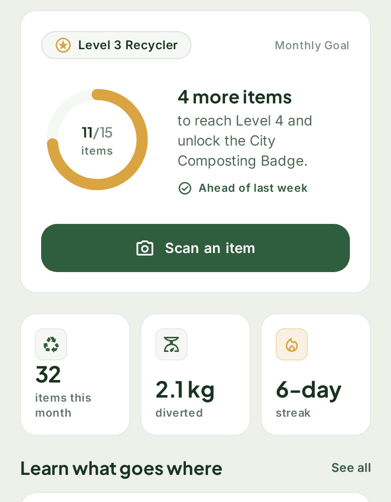
Progress on the final home screen: the Level 3 Recycler card with a ring at 11 of 15 and 4 more items to Level 4, above this month's stats of 32 items, 2.1 kg diverted and a 6-day streak.
Before and after: the module complete wireframe, then the level ring and this month's numbers on the final home screen.

Gamified tracking

Finishing a guide ends on a reward, so the habit has a reason to come back.

The module complete wireframe totals what you saved, 50 cans here. Testers found that page unclear, so in the final design progress moved to the top of the home screen as a level ring: 11 of 15 items.

Impact and learnings

  • 40%

    rise in user confidence about recycling, measured after testing.

  • 9 of 10

    testers said they would use it.

What we learned: clear beats clever, because people recycle correctly when the next step is obvious. Each round of changes started from what testers told us. And a habit needs a reward loop, which is why progress sits at the top of the home screen.

iRecycle home screen: Good morning, Maya, a Level 3 Recycler card with a ring at 11 of 15 and a note that 4 more items unlock Level 4 and the City Composting Badge, a wide green Scan an item button, this month's stats of 32 items, 2.1 kg diverted and a 6-day streak, a Learn what goes where list, a daily tip and a tab bar with Home, Scan, Learn and Rewards.
The final home screen: level ring, scanner and this month’s numbers in one place.

Let’sconnect

Tell me about the product you are building, or the team you are hiring for.

sriumaux@gmail.com
Write to UmaUma on LinkedIn